

Work08EnergySwitch
EnergySwitch: A brand with everyday energy.
Project
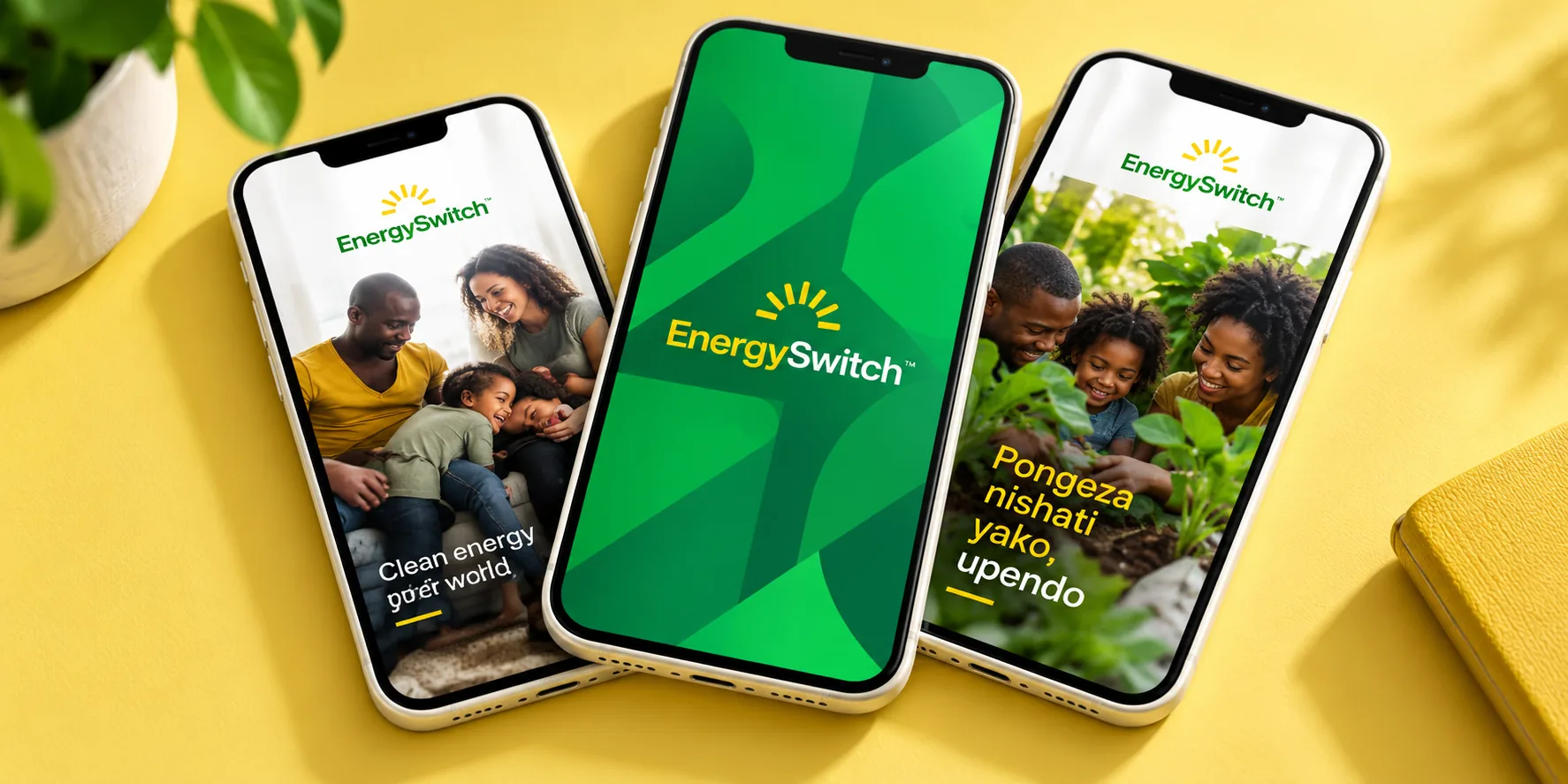
Brand identity for EnergySwitch, a clean-energy brand, carried into the screens, streets and products where customers meet it.
Context & brief
Our EnergySwitch work centres on brand identity development. A clean-energy brand meets people on phone screens, on the street and in their homes, so the identity needed to hold together across all of them.
Our role
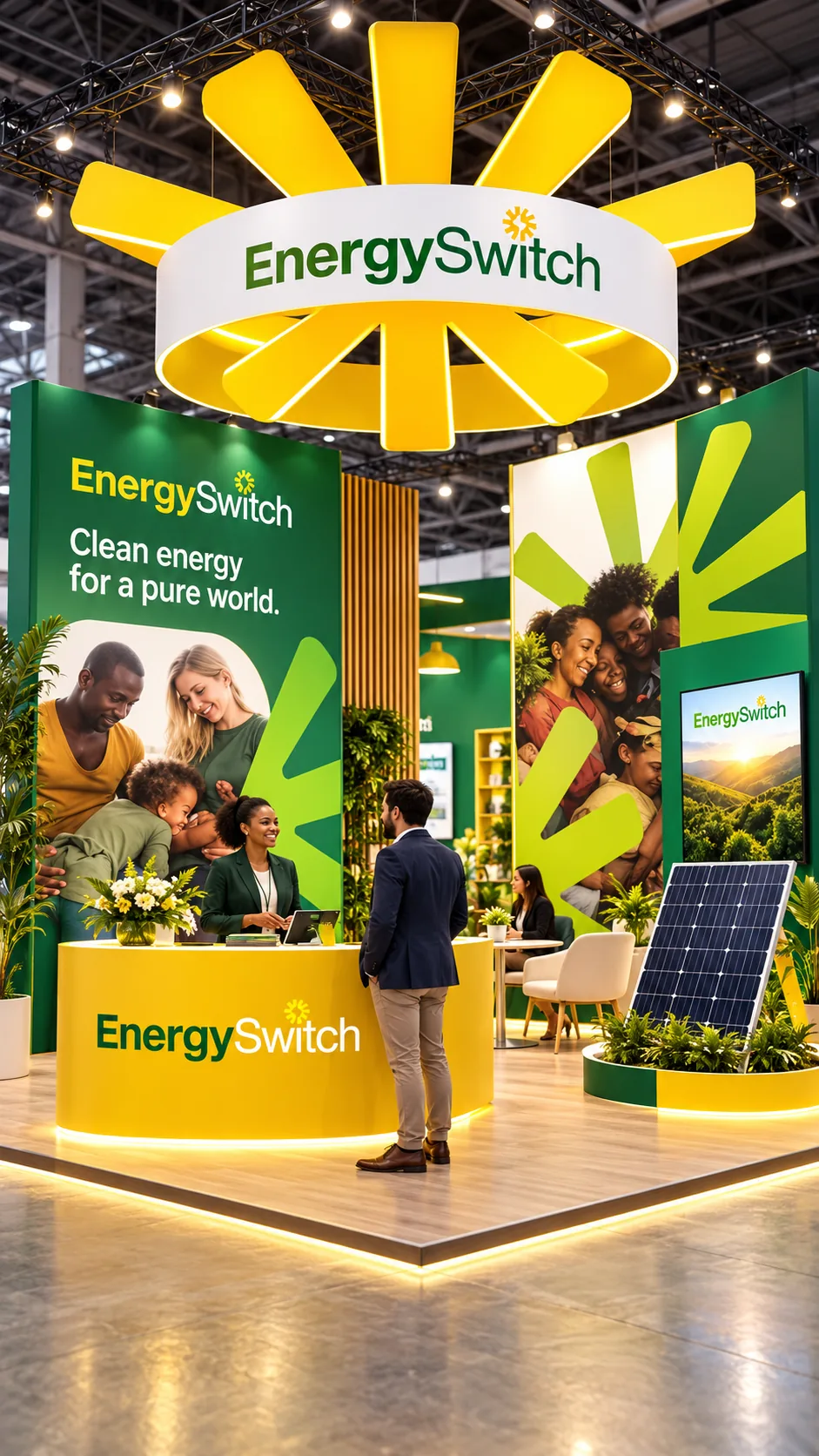
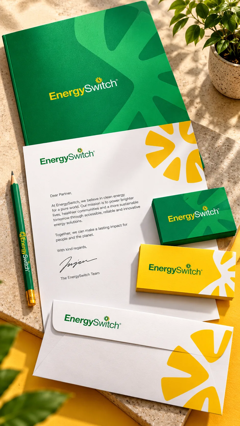
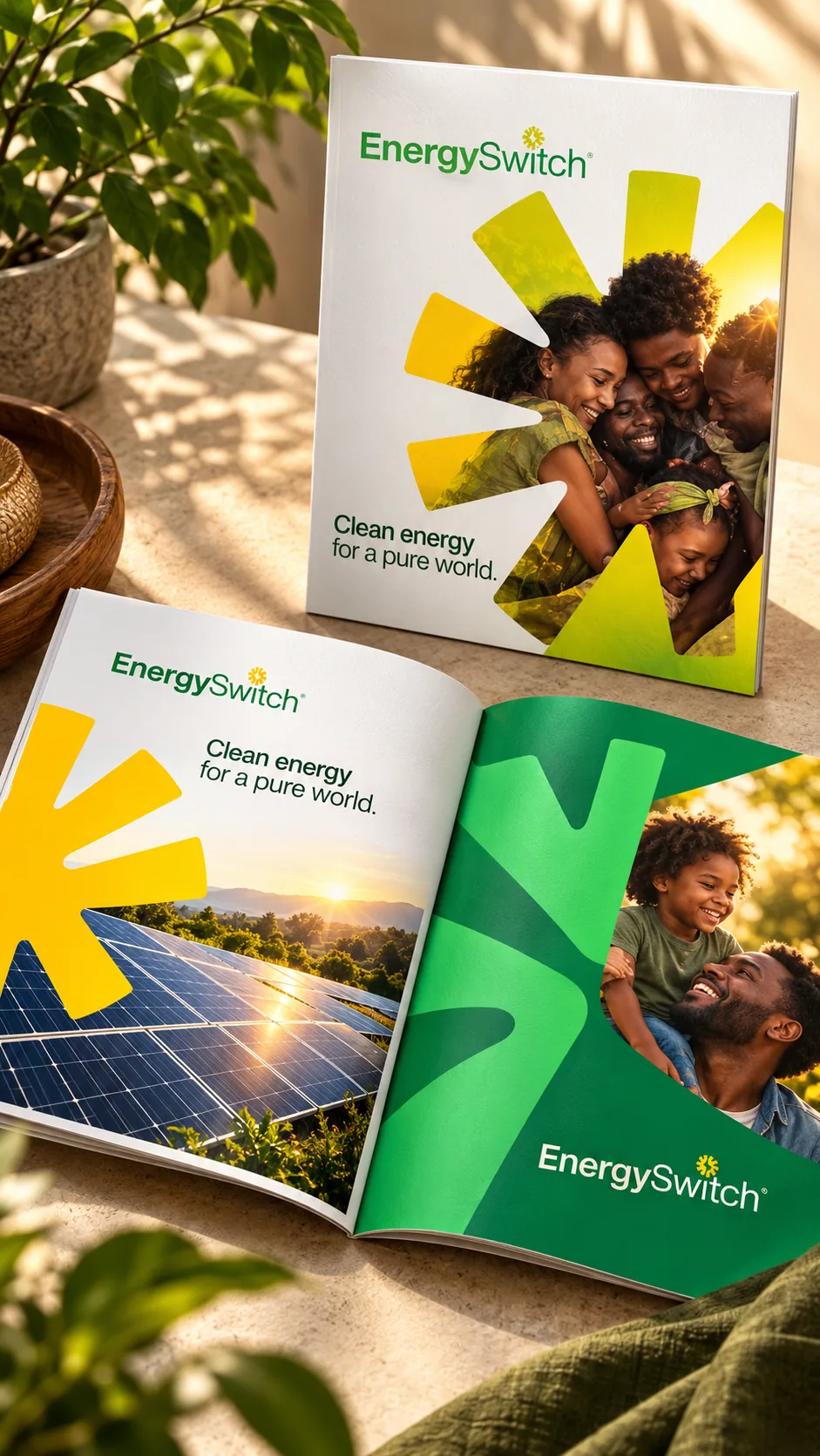
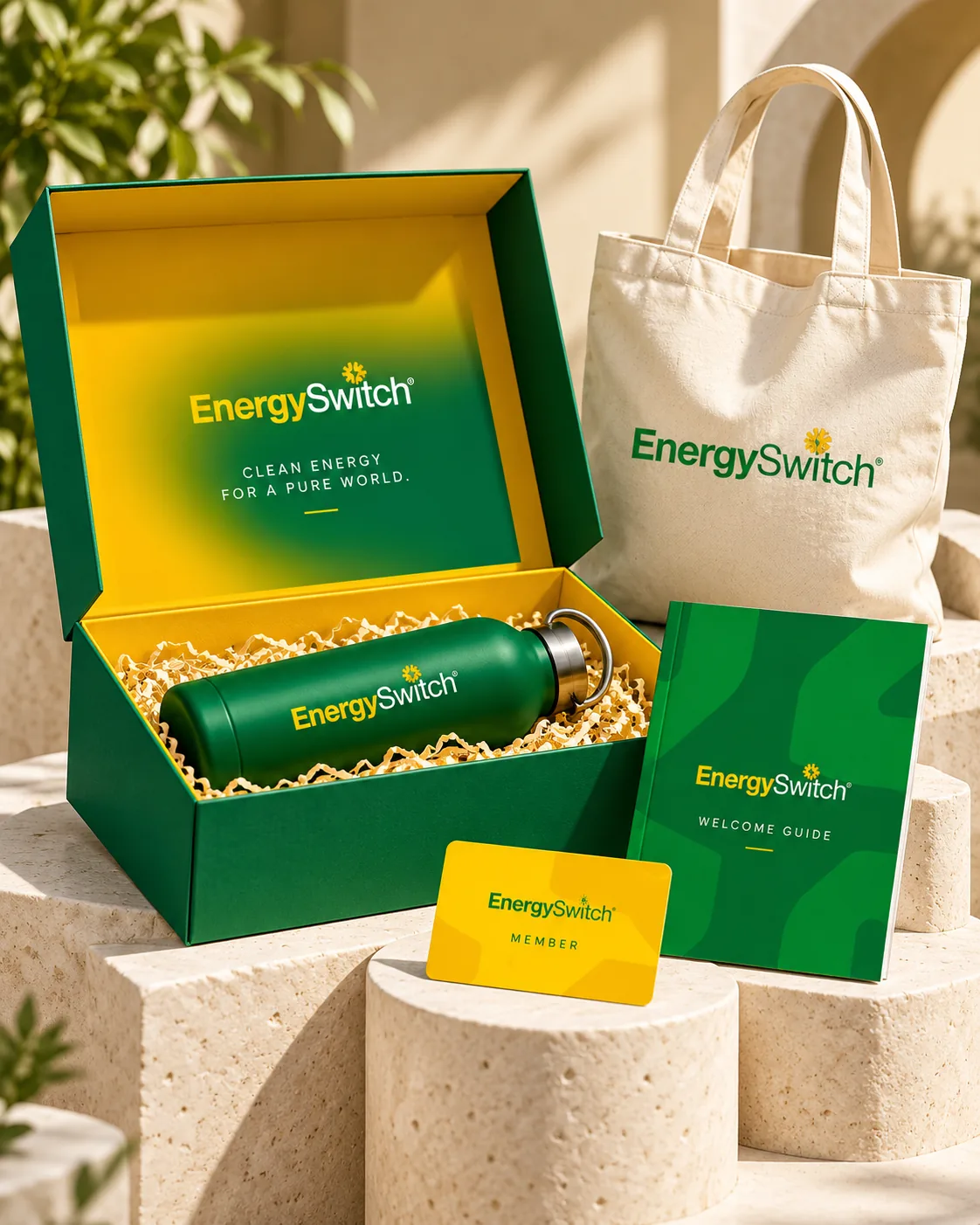
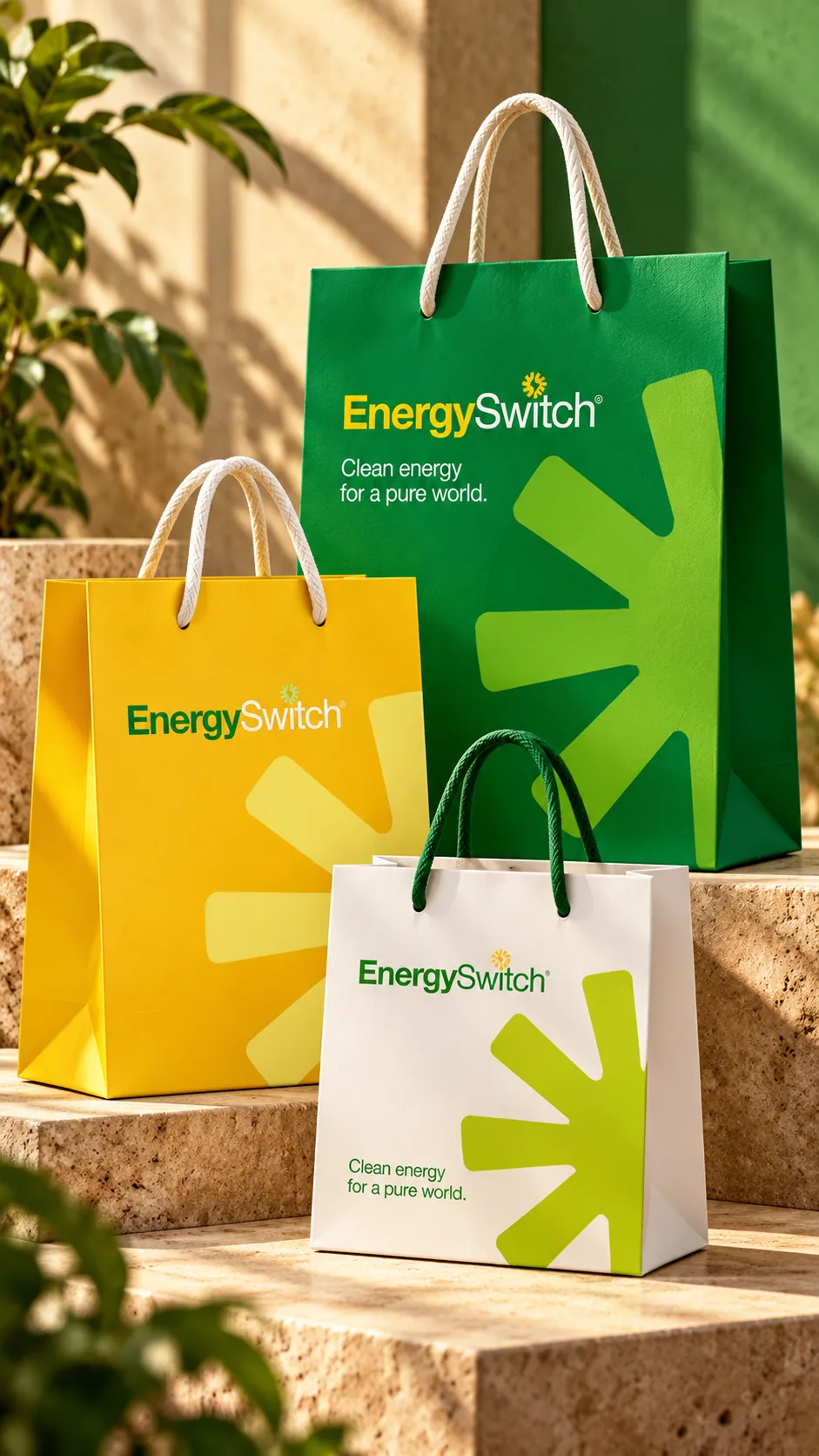
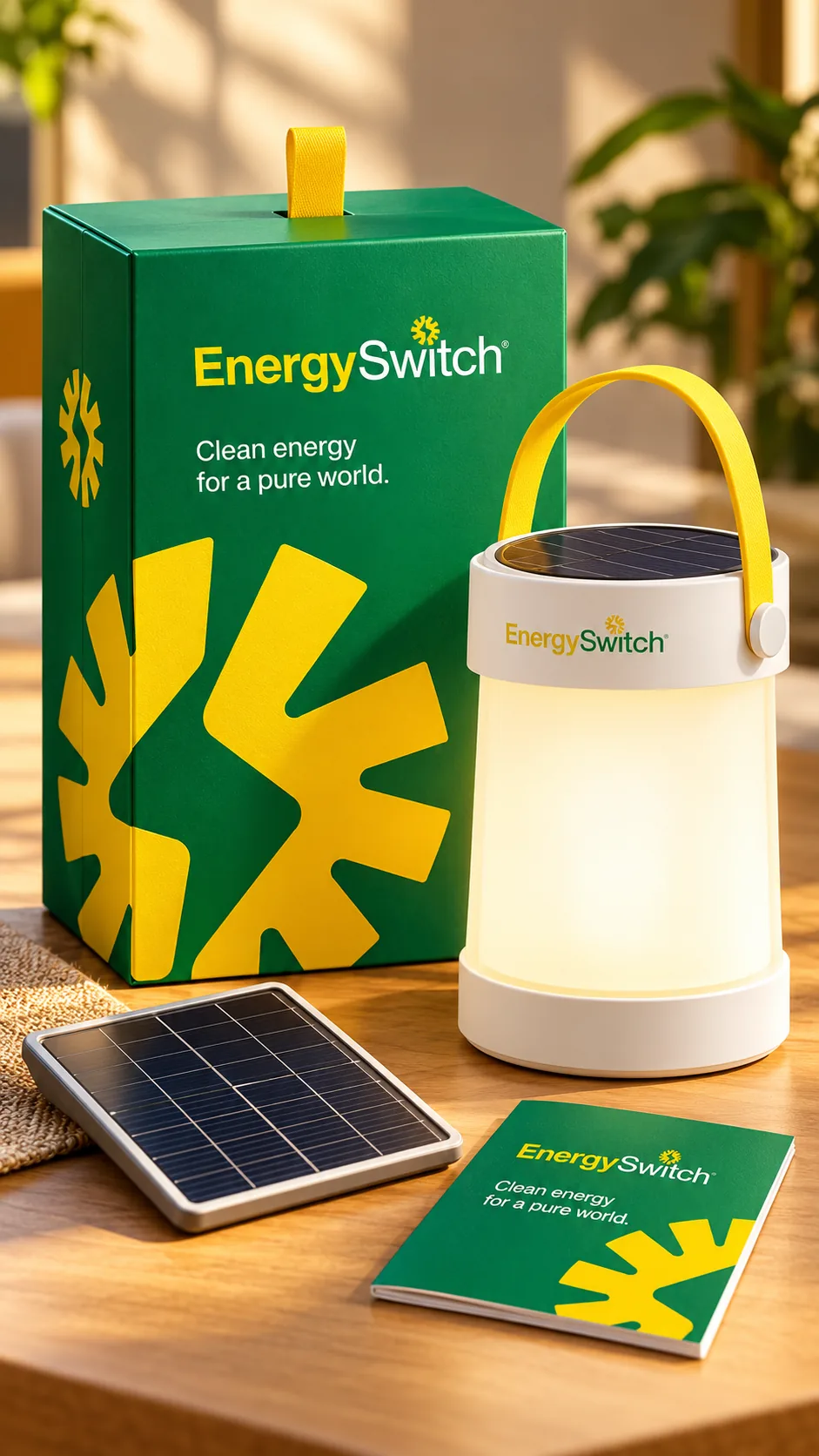
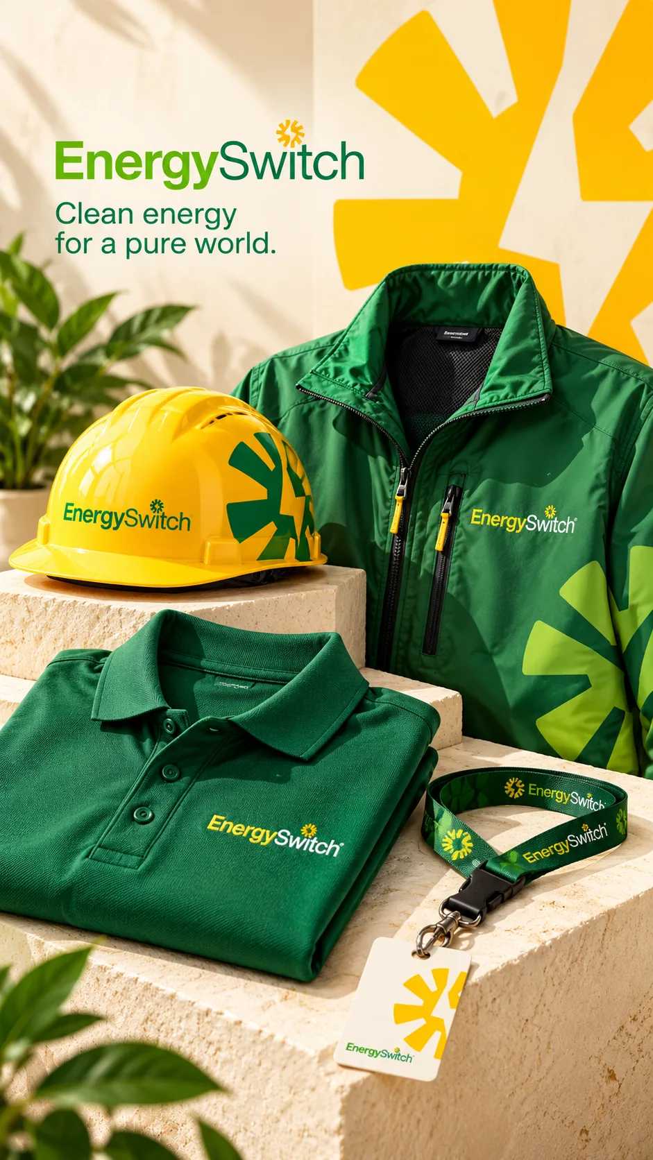
Brand identity development and its applications, from digital screens to print, environmental graphics, vehicle livery, packaging and merchandise.
Creative approach
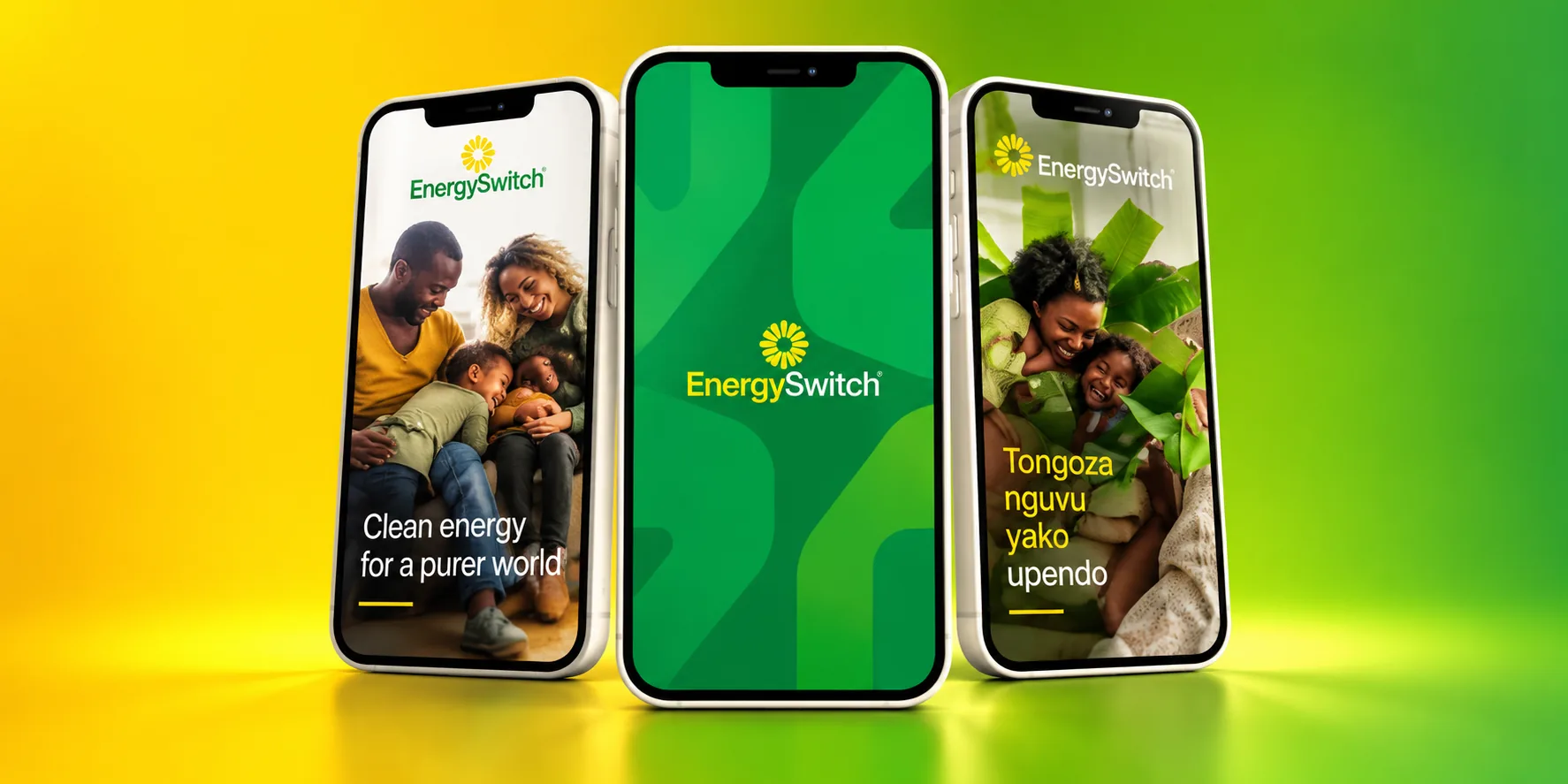
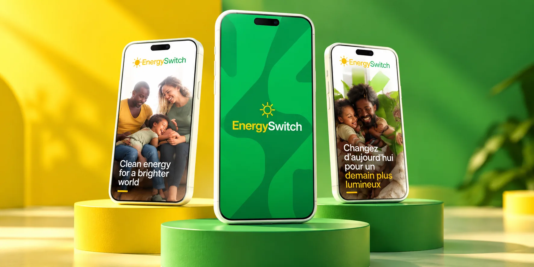
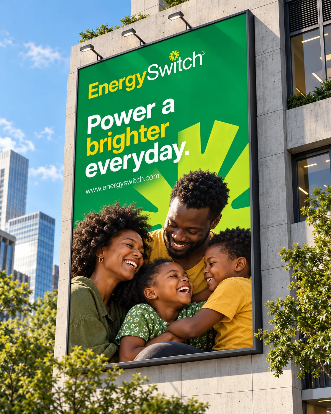
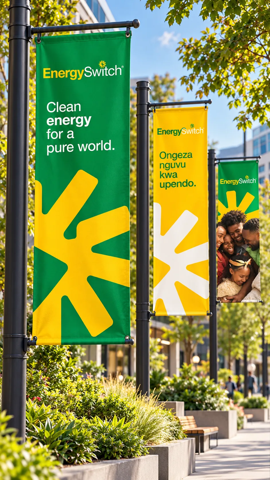
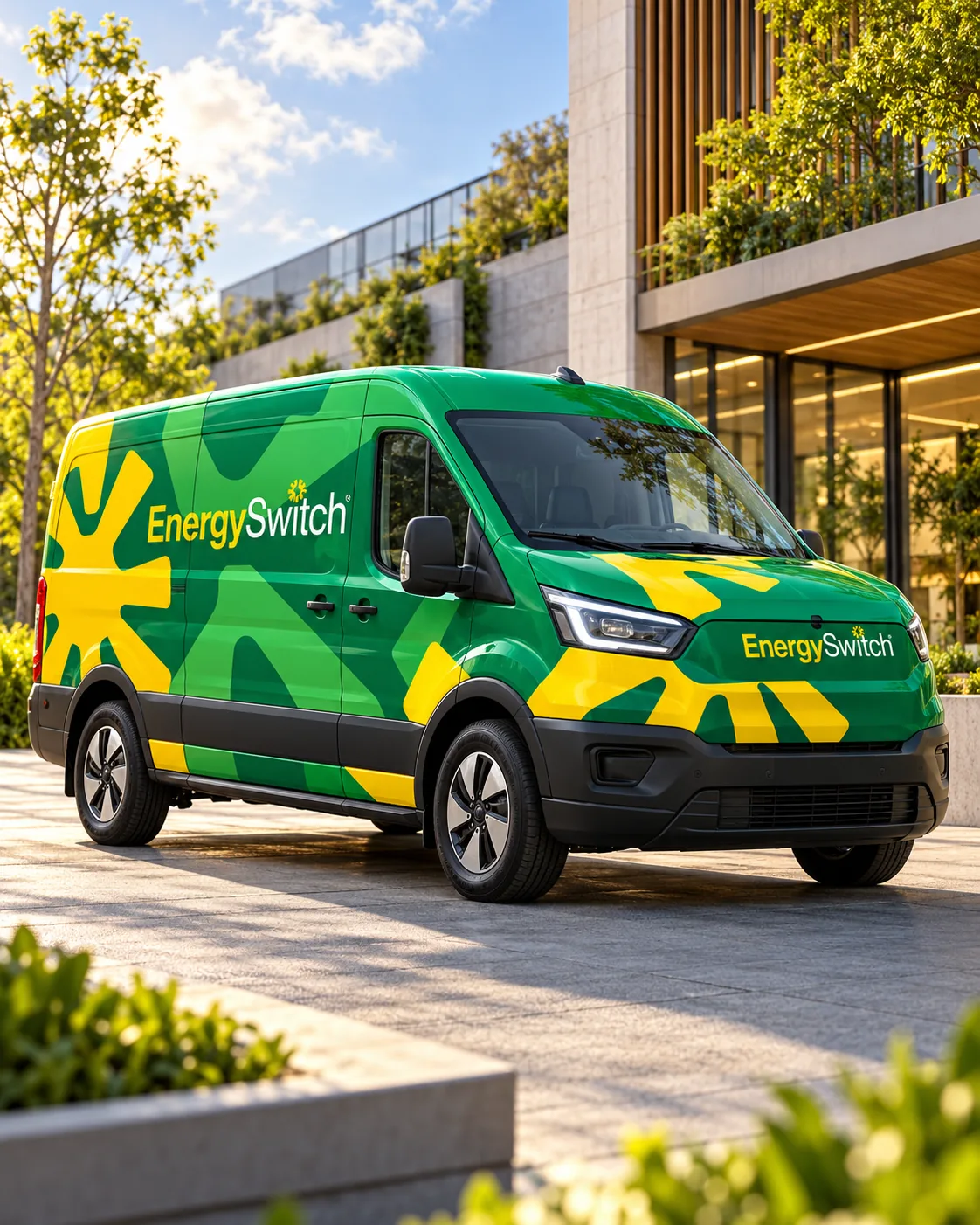
The system pairs a prominent emerald green with a sunshine-yellow sun symbol, cropped large so it works as a graphic device as well as a mark. Warm family photography and a consistent type treatment carry the same character from phone screens to billboards, so the system stays recognisable wherever it appears.
Deliverables
- Brand identity
- Visual language
- Digital brand applications
- Print and stationery
- Environmental and event graphics
- Vehicle livery
- Packaging and merchandise
Recognition in the details.
Digital applications(01)
Identity in use(02)
What the work does
Together, the applications show one visual language carried from customer-facing screens into print, streets, vehicles and products: the green field and sun symbol make each touchpoint recognisable at a glance.
Brand identity / Visual language / Digital applications
Brand applications from the KOKI AFRICA portfolio.
Let’s make thenext move clear.
Tell us what you’re building, changing or preparing to launch.
Start a project